We're Jext warming up
0%

Digital Stories We've Crafted

Digital Stories We've Crafted

Digital Stories We've Crafted

Porsche

Designing Clarity for an Electric Future

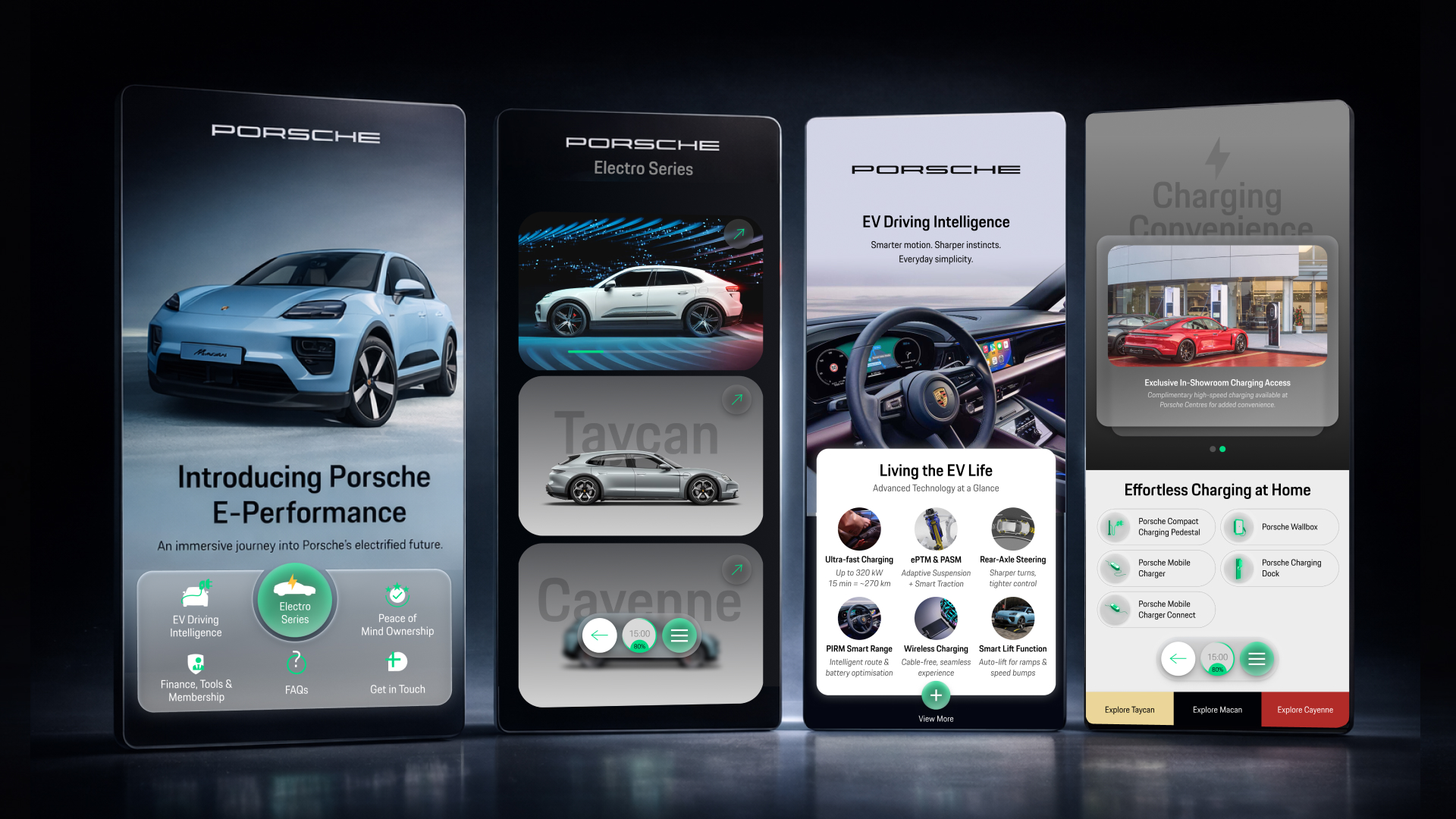
As Porsche expands its electric vehicle range, the brand needed a way to present its EV models clearly within the showroom environment. The project focused on creating an interactive digital tool used by sales consultants on a 55″ display and by customers on iPads during the sales conversation.

Challenge
Electric vehicles introduce new questions for buyers – charging, range, and technology. The challenge was to communicate these differences clearly while maintaining the precision and premium feel expected from Porsche.

Solution
We designed an interactive product experience that structured information across the three EV models into a clear, guided flow. Visual hierarchy and motion cues were used carefully to help users navigate features, technology, and specifications without overwhelming the viewer.

Impact
The tool gave sales consultants a clearer way to present Porsche’s EV lineup while helping customers understand the models with greater confidence during the showroom experience.

Dreamtel Group

Unifying the Digital Hospitality Experience

Dreamtel Group operates multiple hospitality destinations, including hotels, a resort, and a sports complex. The project focused on redesigning the group’s main website to establish a more cohesive digital presence across all destinations.

Challenge
With multiple destinations under one brand, the challenge was to present each property distinctly while maintaining a consistent brand identity across the group.

Solution
We designed the website UX and visual system to structure content more clearly and create a unified design language across destinations. The system allows each property to express its character while remaining visually and strategically aligned with the Dreamtel brand.

Impact
The new digital presence strengthened brand cohesion across destinations while making it easier for travellers to explore destinations and understand the Dreamtel experience.

DRINX

  • Expressive Brand Direction
  • Interactive Digital Experience

Redefining Everyday Indulgence

DRINX is a lifestyle beverage concept built around energy, personality, and self-expression. The work focused on translating this character into a bold, recognisable visual identity designed to live confidently across digital touchpoints.

Challenge
To create a visual language that stood out without becoming chaotic – expressive and vibrant, yet structured enough to remain cohesive across layouts, typography, and motion.

Solution
We developed a distinctive visual system balancing strong colour, expressive typography, and dynamic composition. Motion was used with intention, adding rhythm and energy while maintaining clarity and control.

The system was built to scale, allowing DRINX to expand across formats while preserving a consistent tone and recognisable identity.

Impact
The identity positioned DRINX with confidence and energy, clearly differentiating it within a crowded category. It established a flexible foundation for future digital growth without compromising the brand’s character.

SEEFIRST.AI

  • AI & Innovation
  • Digital Experience Design

Where Technology Feels Human

SEEFIRST.AI is a fashion technology concept designed to help users make more confident purchase decisions online. By allowing users to visualise garment fit before buying, the experience shifts from guessing sizes to seeing outcomes. The project focused on translating advanced technology into an interface that feels intuitive, reassuring, and easy to use.

Challenge
AI-driven products often struggle with approachability. The challenge was to present complex functionality without overwhelming users or making the experience feel technical or intimidating, while guiding them smoothly through a multi-step interaction.

Solution
The experience was designed around simplicity, flow, and visual clarity. Interface elements guide users naturally through each step, allowing the technology to operate quietly in the background.

Motion and interaction were applied with restraint, providing feedback and reassurance at key moments. The design prioritised ease, familiarity, and emotional comfort over technical explanation.

Impact
The resulting experience transformed a complex AI concept into a product that feels accessible and confidence-building. By focusing on user understanding and reassurance, SEEFIRST.AI is positioned as a tool that supports better decisions rather than complicates them.

Novern Group

  • Brand Identity
  • Corporate Digital Strategy

Leadership, Crafted with Clarity

Novern Group is a corporate organisation operating across multiple business areas. The project focused on establishing a clear, credible brand identity that could represent the group as a whole while supporting future growth and diversification across corporate and digital touchpoints.

Challenge
As a group-level brand, Novern needed to communicate authority without feeling rigid or dated. The identity had to balance professionalism with approachability, while remaining coherent and scalable across varied contexts and audiences.

Solution
We developed a brand system grounded in clarity, hierarchy, and consistency. The visual language was designed to be disciplined yet flexible, allowing the identity to extend across platforms while maintaining a unified presence.

The digital direction prioritised structure and navigation, ensuring information was organised logically and presented with confidence.

Impact
The resulting identity positioned Novern Group as a composed and credible organisation. It established a strong foundation for future communications, enabling the brand to grow while maintaining clarity, consistency, and trust.

Armana Villas

  • Experiential Digital Design
  • Spatial Brand Direction

The Architecture of Stillness

Armana Villas is a residential property concept shaped around calm, space, and understated luxury. The project focused on creating a brand identity and digital direction that reflected the lived experience of the development, rather than relying on overt marketing cues.

Challenge
Property branding often leans on visual excess or generic luxury signals. The challenge was to communicate premium value with restraint — ensuring the brand felt composed, considered, and timeless across digital platforms.

Solution
We developed a visual system grounded in lightness, spacing, and balance. Typography, colour, and layout were designed to breathe, allowing content to unfold with intention rather than compete for attention.

The digital direction prioritised flow and clarity, guiding users through the experience with subtle transitions and a clear hierarchy.

Impact
The resulting identity positioned Armana Villas as a calm and confident residential brand. Its digital presence reinforced a sense of quiet refinement, delivering a premium experience without excess.

BREGO

  • Brand Clarity
  • Scalable Identity System

When Direction Needed Redirection

BREGO is an independent healthcare company seeking a clearer and more confident digital presence. When the existing visual direction no longer aligned with its goals, Jextures was engaged to rebuild the brand’s digital expression with greater clarity, consistency, and intent.

The objective was to create a system that could support ongoing communications, not a one-off redesign.

Challenge
The visuals lacked coherence and emotional clarity, making it difficult to communicate trust and professionalism. Without a clear creative direction, the brand struggled to scale campaigns while maintaining alignment within a sensitive healthcare context.

Solution
Jextures redefined BREGO’s creative direction from the ground up, establishing a cohesive visual system across colour, layout, typography, and motion. The refreshed system brought structure and consistency, ensuring all elements worked together with purpose.

The corporate identity guidebook was refined to support consistent application across future campaigns.

Impact
The refreshed digital system gave BREGO a clearer and more confident presence. Improved consistency allowed the brand to scale its messaging without losing identity, leading to an ongoing working relationship across multiple campaigns.

Got it!

Thanks for sliding into our inbox. We'll hit you back soon.
Scroll to explore